Every Graph Tells a Story: Teaching Tips
By Sophia E. Hayes, Ph.D., Professor in the Department of Chemistry and Institute for School Partnership Faculty Fellow, Washington University in St. Louis

Practitioners in nearly all fields communicate the results of their data gathering via graphs. Informed citizens, reading newspapers and magazines, are also regularly exposed to charts and graphs for showing data (side note: see https://pudding.cool for some amazing depictions of datasets.) Just like chemical structures or sheet music, we use a set of symbols and conventions to ultimately convey complex information in each and every graph. I tell my students, “graphed data aren’t dry, analytical objects – seen in the correct light, every graph actually is telling you a story.”
Let’s look at the graph below as an example. It’s fairly complex, and students can struggle at times trying to intuit what is the important feature of the graph, what part to focus upon. As a teacher, I do two things:
- I break down the graph in a step-by-step description, slowing down to walk students through all parts of the plot.
- I try to anticipate what they might be wondering: should I focus on those “ripples” I see in the plot; is the downward trend the point of the graph; and is the steepness of the plot important?
A simple story about the graph can be told in several parts. As a teaching tool, I ask my students to tell a story based on such a picture, as an in-class exercise:
- Begin with a short title.
- Take pains to illustrate the axes individually, and describe their units and trend. (Taking time to do this allows your students to take in the graph, in parts.)
- Describe the shape, focusing on the part(s) that communicate the story
Here is one scenario of those 3 steps as a story:
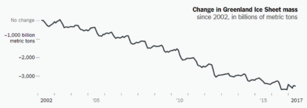
“Here is a graph of the loss of mass of the Greenland ice sheet over time.” (title)
“Along the x-axis is time in years shown from 2002 to 2017. The y-axis has a negative scale in billions of metric tons of ice. These numbers are negative because they start from 0 (in 2002) and decrease with time.” (axes description)
“The Greenland ice sheet has been losing mass between 2002 and 2017. There are ripples in the plot, reflecting the seasonal loss of ice in summer and gain in winter, but those aren’t our focus. What’s important here? Note, the ice sheet decreases slowly at first (2002 – 2005), but there is more mass loss (we’d say ‘the rate of mass loss increases’) from about 2005 – 2012. It appears to be a little less steep between 2012-2017 – so maybe this process is slowing down – but we’d need more data to be certain.”
By asking students to undertake this exercise, they learn the process of careful examination, discovering the narrative in dataset. I hope and believe it influences how they look at all data thereafter, long after my class is over.
——————————–
Great resources (thanks for this curated collection from Ben Nims, University College):
- MyNASA Data – NASA’s educational outreach has created data literacy cubes (dice, basically) to use in the classroom. There are cubes for maps, data, and graphs and there are there are cubes with different levels of difficulty to help differentiate in your classroom: https://mynasadata.larc.nasa.gov/data-literacy-cubes-graphs-maps-and-data-tables
- Our World in Data – This is a treasure trove of economic, demographic, and environmental data that is global in scope. You can analyze pre-made graphs, generate your graphs based on indicators you select, do time-lapse, etc.: https://ourworldindata.org/
- New York Times: What’s Going on in this Graph? – The New York Times publishes beautiful graphs and data on a range of topics. They are conducive to inquiry and generating discussions about data in classrooms: https://www.nytimes.com/column/whats-going-on-in-this-graph
Additional Resources: Posted PowerPoint , coming soon: a simple in-class, non-scientific exercise to practice this data story telling on linear plots of data.
Teaching Tips is a new series of small ideas for making big changes to your teaching. Watch out for more teaching tips throughout the semester on our blog, or head to the Teaching Center’s resource page for more ideas.